Where It All Began
The Client came to me in search of a new logo. Although they were happy with their original logo, conflicts of interest were the driving force to choose a new logo. bearing this in mind, I started by analyzing the intent of the original logo to see what "flavor" the client preferred when representing the Away Out Non-profit organization for youth/teen girls.
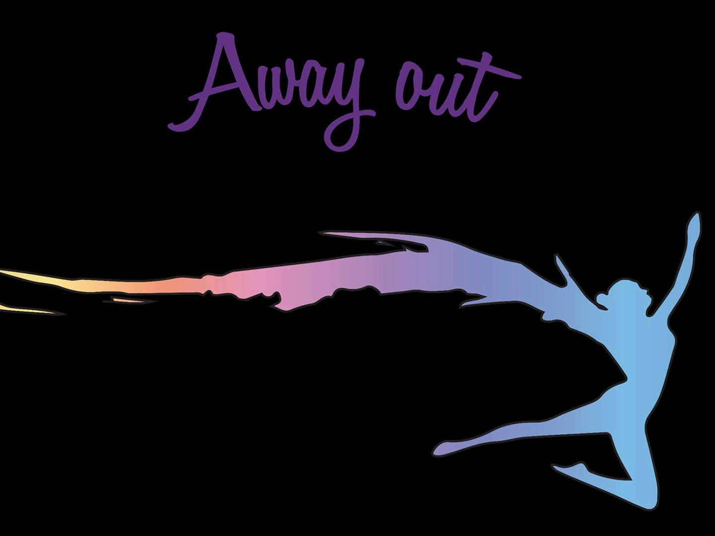
The original logo
Conceptual Stage
I began by iterating over a few ideas; gaining inspiration from similar concepts to the original mythical figure. My approach involved the exploration of movement, and the qualities of Angels (winged creatures), Mermaids, elemental factors (water and fire), and motion of line.
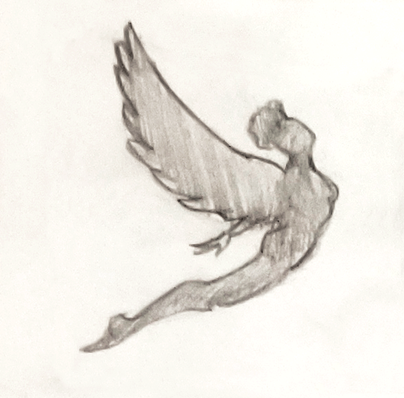
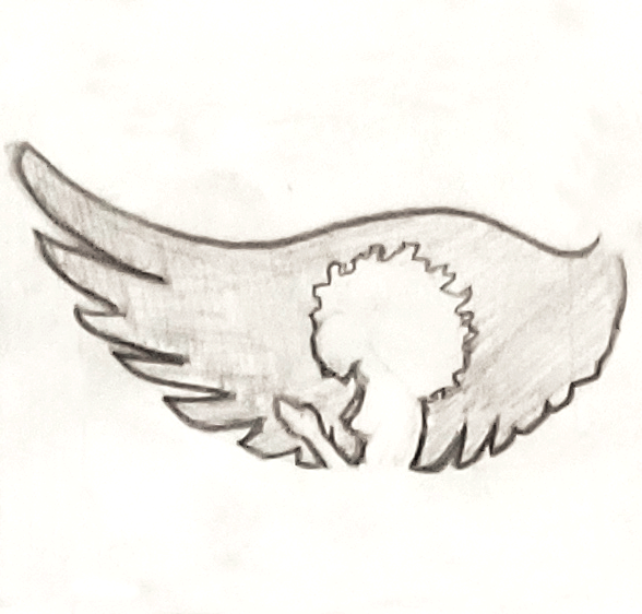
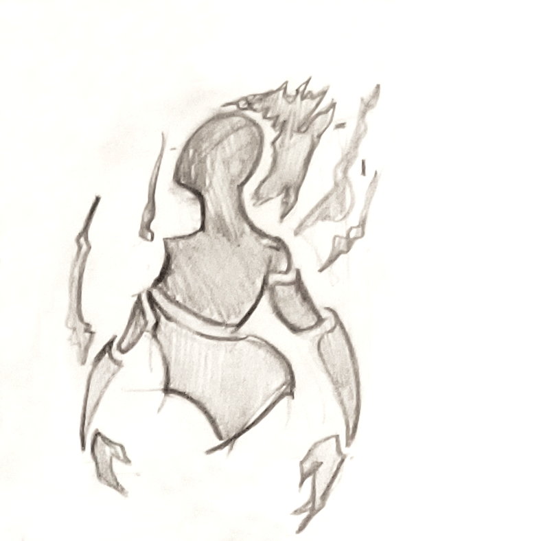
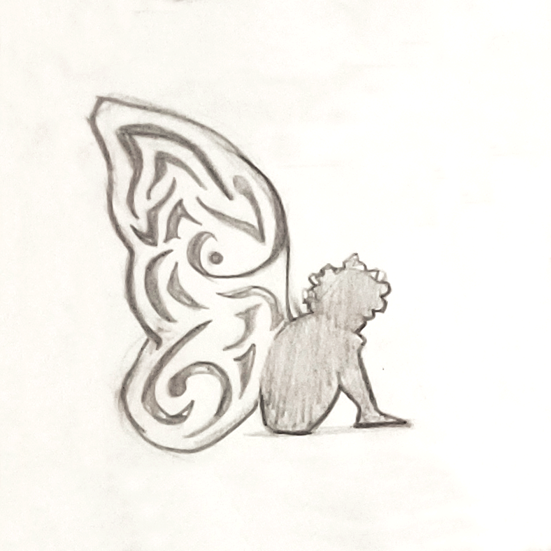
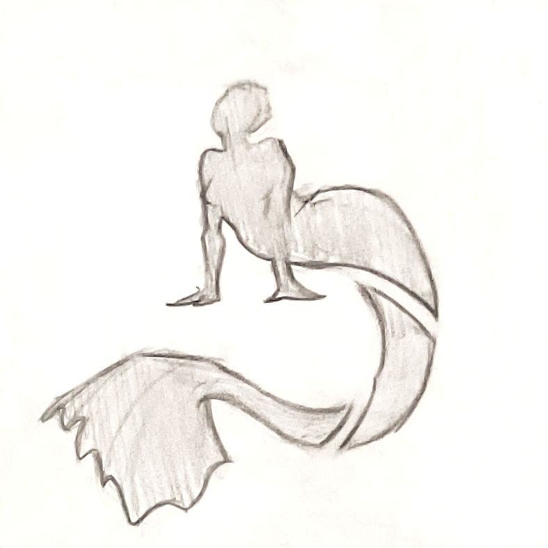
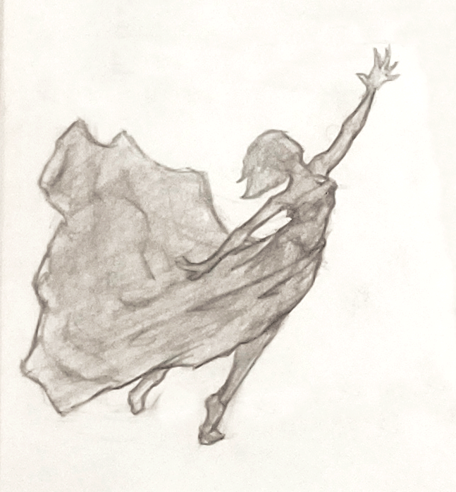
Concept sketches
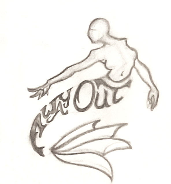
The Final Logo
The final version the client and I decided upon was #6, and used a color palette of royalty and elegance. We combined additional elements such as the crown, the shooting star, and designs within the negative/positive space to imply jewelry.
Ultimately, we created a logo that was much cleaner than the original, but still portrays the message of qualities as the original logo.
The final design - AwayOutForQueens.com
Why Stop at a Logo?
This is the web-page that we created I created for the organization. In order to make a page like this, I referred to references and trends in the front-end design/development industry. The goal was to create something "sweet & charming," yet appealing to not only prospective girls who may be interested in joining, but the parents/general audience as well.
The completed website